I’ve realised that I didn’t produce a graph for the month of December, so I will be looking at both December and January in this post.
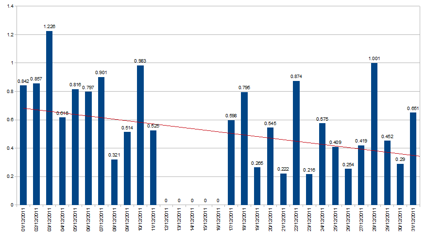
When I looked at the power generation graph for November, the overall trend-line was going down. In December this trend continued with the trend dropping from about 0.7 to less than 0.4 kWh generated per day. There were a few days where we reach near to or exceeded 1 kWh, but a lot of the days were fairly grey. For 5 days (12-16th Dec) our wireless (Sunny Beam) display had a flat battery because I’d not connected it for a week or so to charge it, but it generated approximately 3 kWh during those days (i.e. an average of about 600 Wh each day) which is not reflected in the graph below and the lack of those values will almost certainly have skewed the trend downwards.
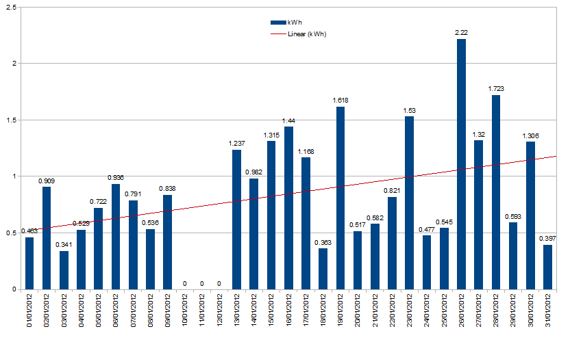
In January however, the trend line on already on its way up – note that the zero figures for the 10th, 11th and 12th are, like in December, an error where no figures were recorded because the device’s battery ran out. In both cases though, they were still recorded in the total by the official meter. It looks like those missing days in January averaged about 400 Wh each (i.e. about 1.2 kWh total).
Even without those figures the trend increased from just over 0.5 kWh to about 1.2 kWh. 26th January was, as previously posted, the highest generation figure of 2012 (and the highest since the first two days of November) at 2.22 kWh.

